Personal
“Fear and Loathing”
A self-initiated project in which I explore what a Fear and Loathing in Las Vegas movie re-release could look like. As one of my favorite movies, Fear and Loathing in Las Vegas was a true pleasure to revisit and view from a more analytical perspective. For inspiration, I tapped into the designs I saw in my childhood.
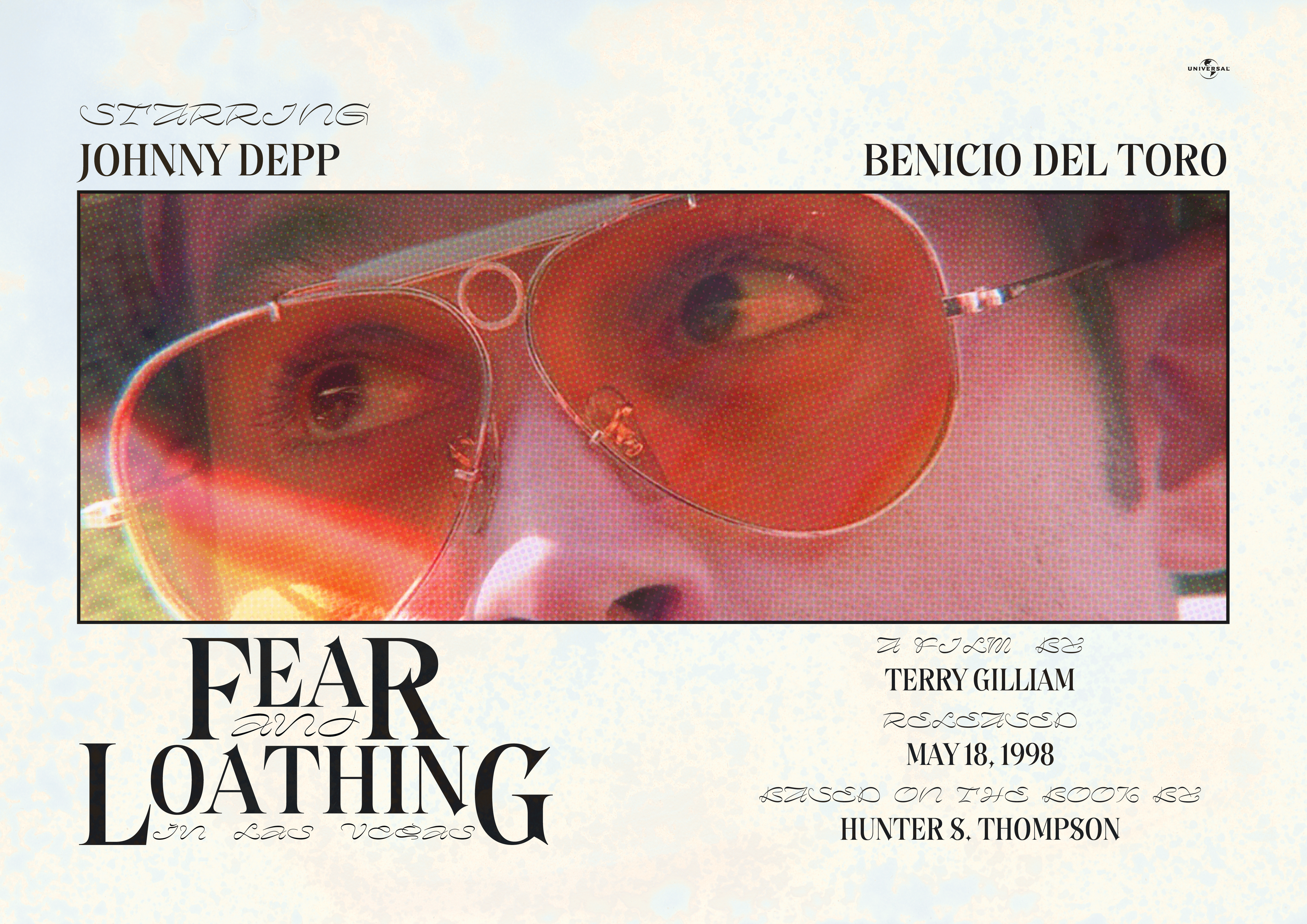
When designing the key art, I again leaned into the designs I saw in my childhood. A relatively common design practice I remembered seeing on VHS tape covers was using a still from the film rather than a posed or composited promotion photo, and housing it in a way that didn’t dominate the entire composition. The typefaces used in the key art reflect those used in the lockup.
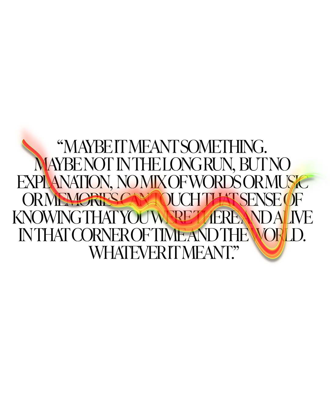
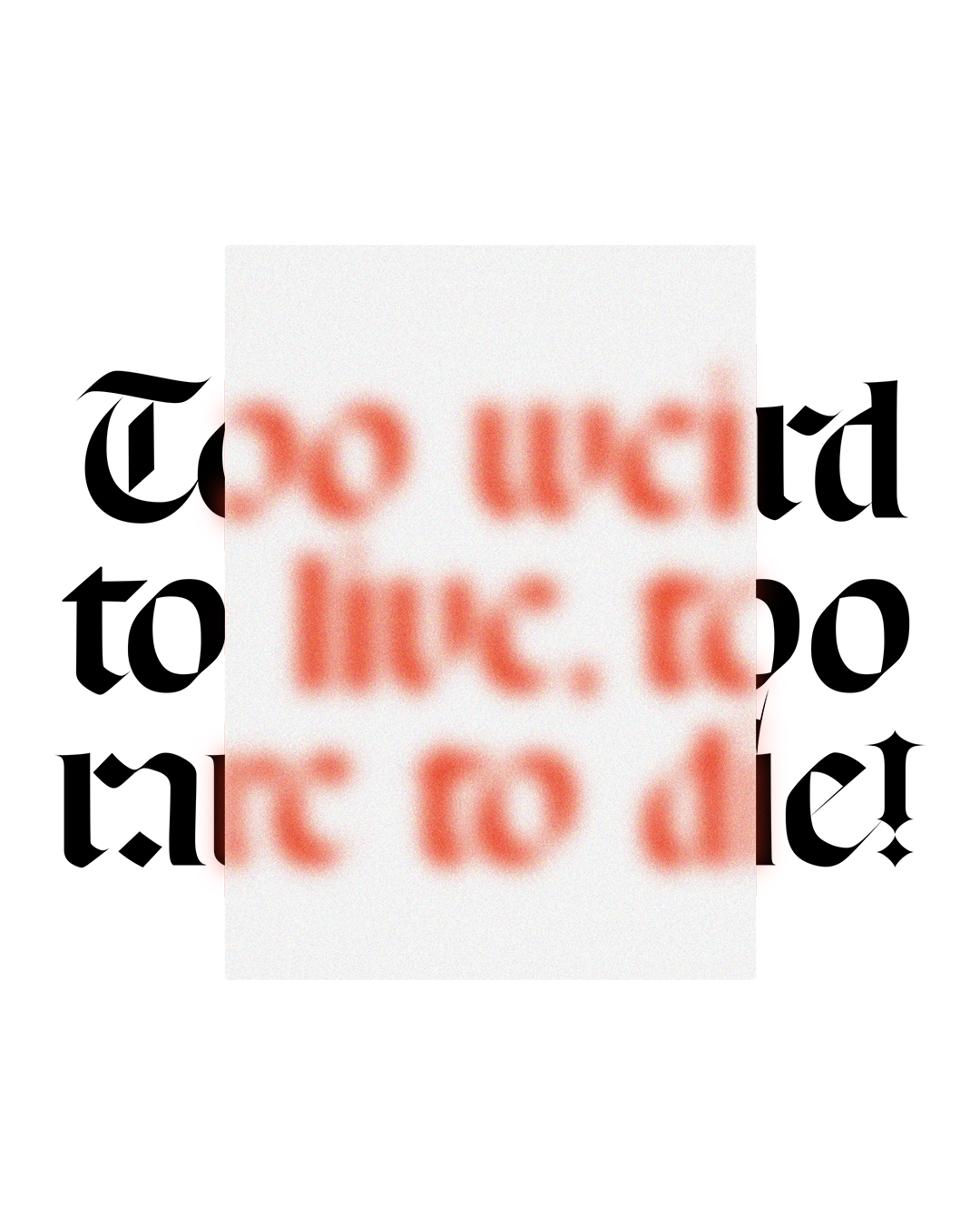

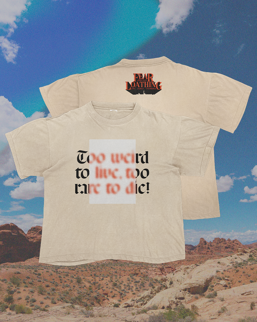
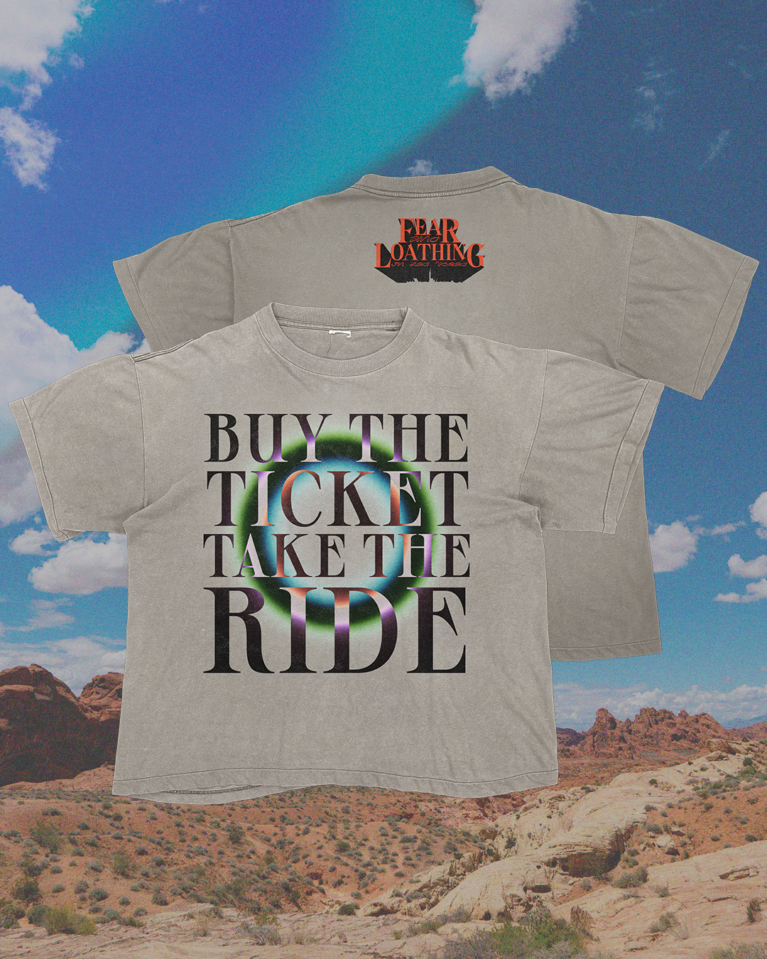
The subsequent rollout for this re-release campaign consists of three distinctly different experimental typographic treatments of some of my favorite quotes from the film. I wanted to steer away from the obvious choice to go heavy with psychedelic references, while still capturing that essence. What I came up with were designs that incorporated aspects of distortion, obstruction, and saturated color play which help elevate the designs from movie merchandise to pieces that can truly stand on their own.