H.R. Macmillan Space Centre
“Experium”
What I was listening to:
• naming
• identity
• web
• collateral
• identity
• web
• collateral
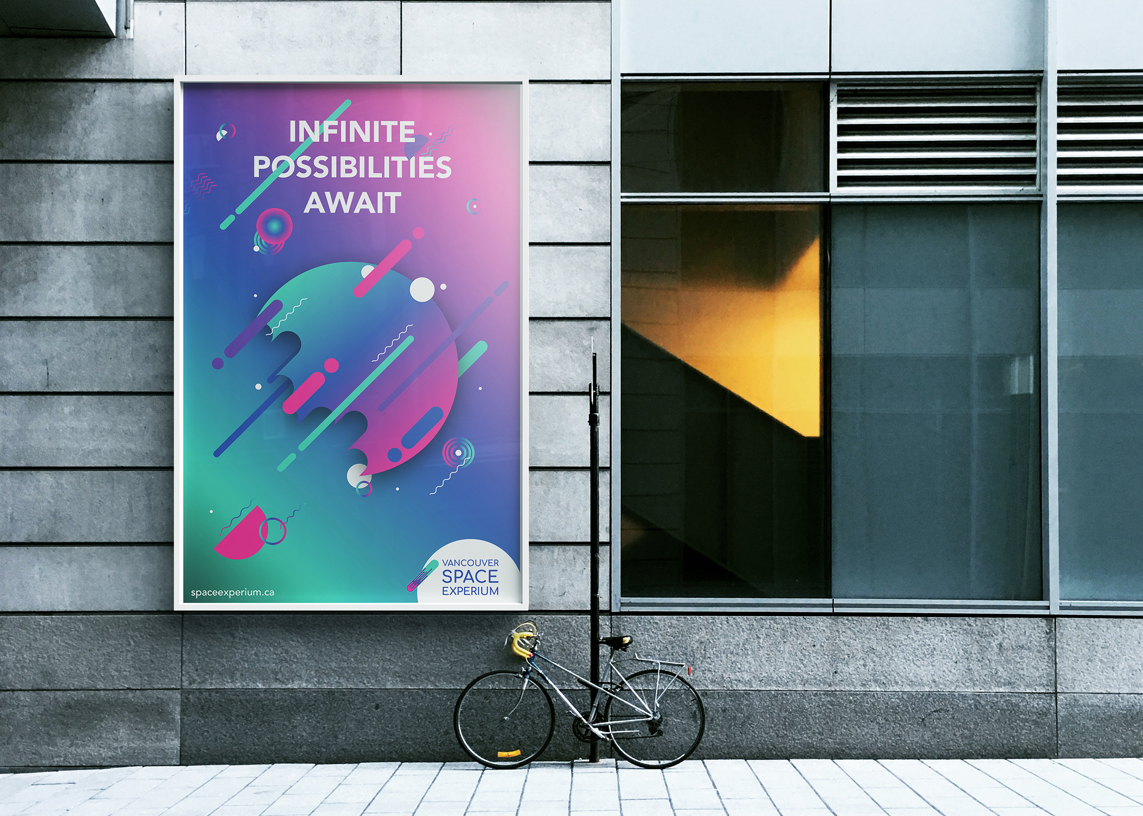
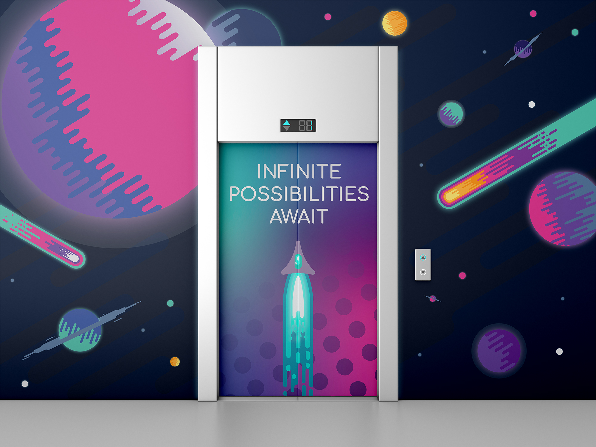
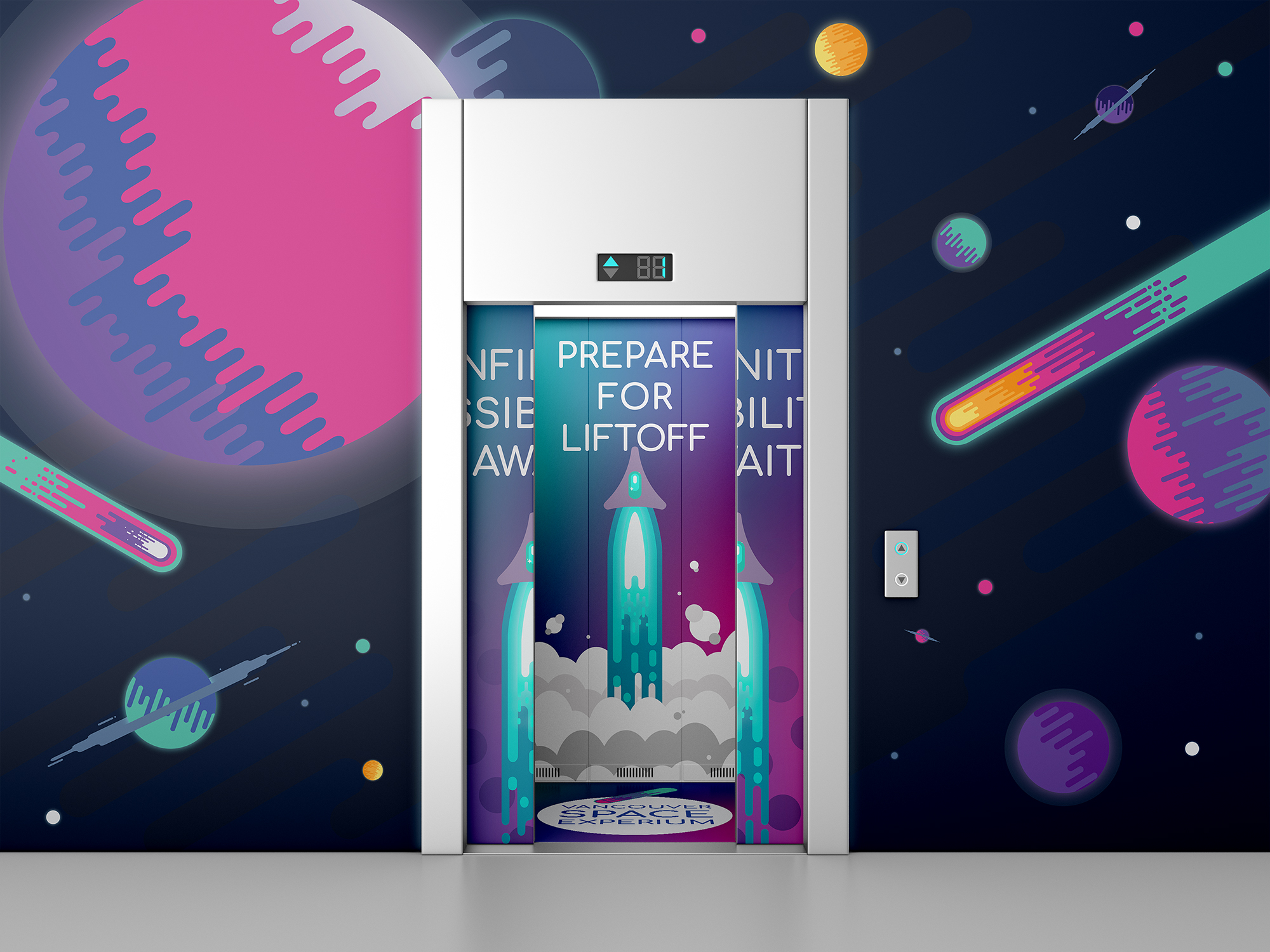
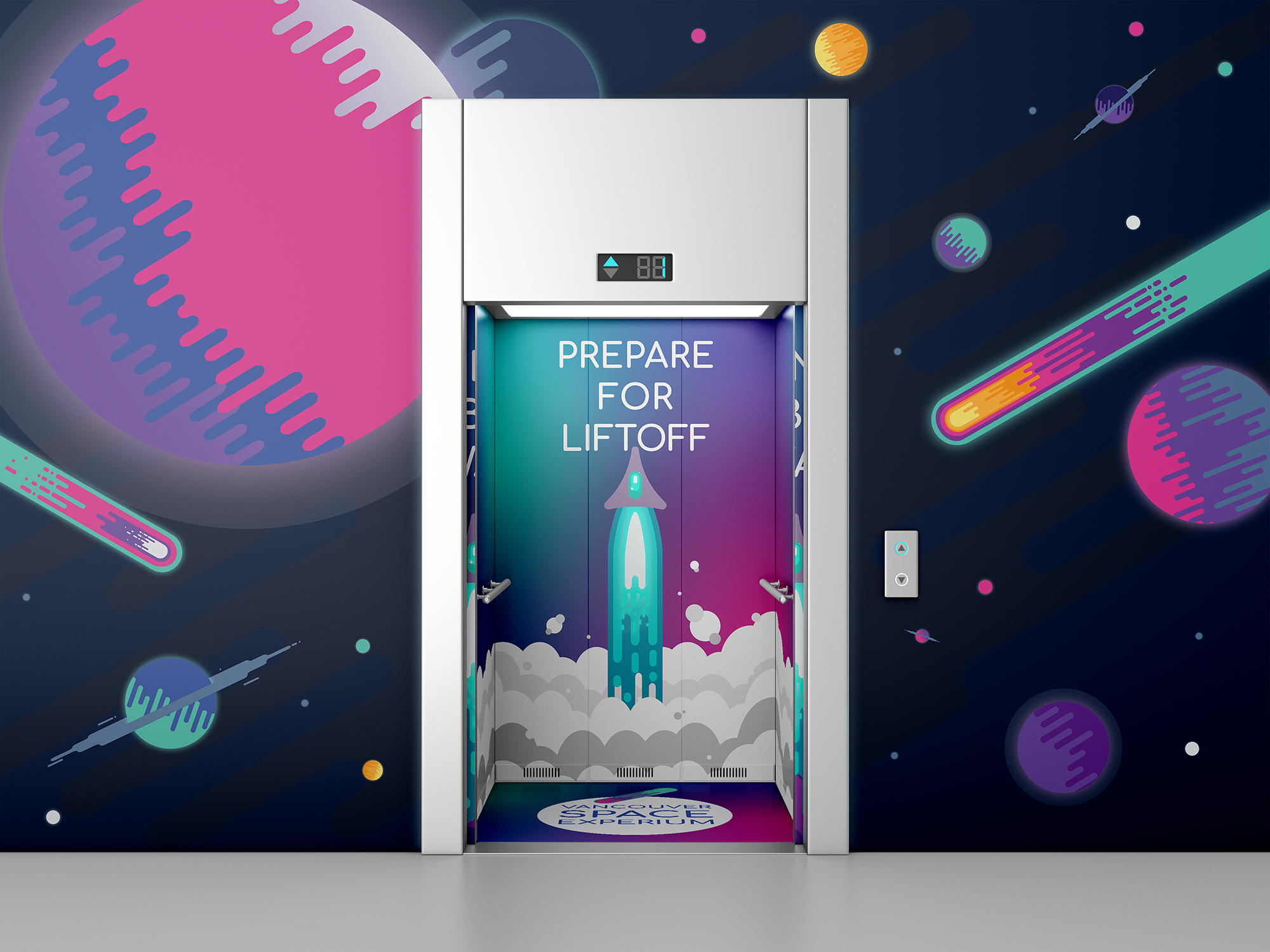
Tasked with developing a new brand identity for the H.R. Macmillan Space Centre in Vancouver for the purpose of boosting the number of visitors and general brand equity. Expectedly, the new brand needed to convey the topic of the museum, space, and make it exciting and accessible for the audience, children and their parents. Research for this project included competitive analysis and assessing the modern museum landscape.
This project was created as a concept for the H.R. Macmillan Space Centre at Shillington Education in New York.
This project was created as a concept for the H.R. Macmillan Space Centre at Shillington Education in New York.

After several iterations, the name Vancouver Space Experium was decided upon. I wanted to highlight the interactive and experiential aspects of the museum as they proved to be the most popular exhibits according to reviews.
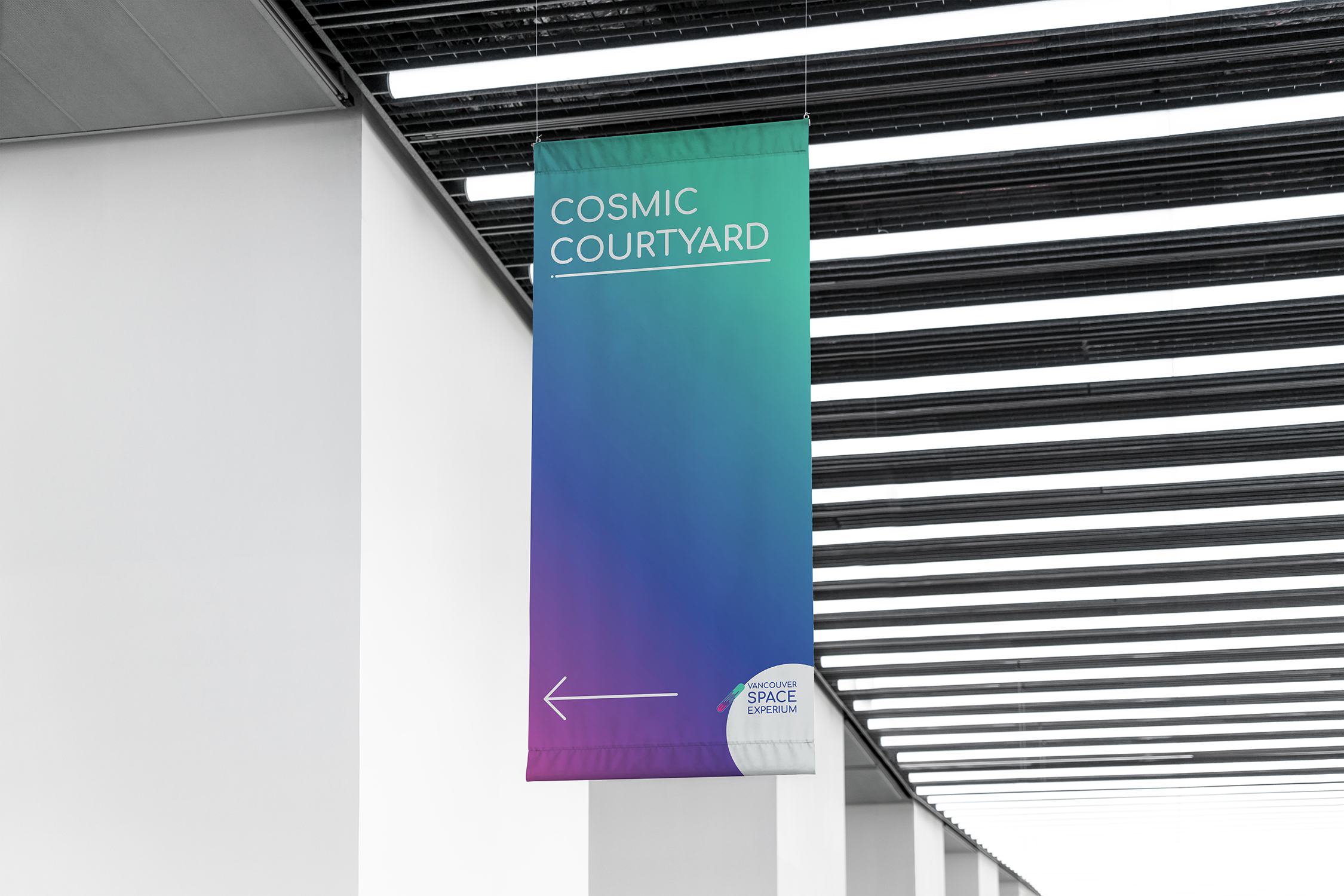
The logotype features a playful, round sans serif typeface that feels friendly, approachable, and modern. A bright, bold, aurora-inspired color palette was chosen as it feels fresh, exciting, and is evocative of space.
The logotype features a playful, round sans serif typeface that feels friendly, approachable, and modern. A bright, bold, aurora-inspired color palette was chosen as it feels fresh, exciting, and is evocative of space.

The logomark uses a simple, flat illustration style that appeals to a youthful sensibility without being alienating to an older audience. The meteor shape is tied to the idea of shooting stars and having big dreams. There is also a subtle ‘E’ at the center of the mark.

